These challenges are designed with Figma and are for visual representation.
Skills
Web Designing
0%
On-page SEO
0%
HTML5
0%
CSS3
0%
3D Shape
0%
Examples of Projects
These challenges are designed with Figma and are for visual representation.
Gaining Skills...
Web Designing
SEO
HTML5
CSS3
3D Shapes
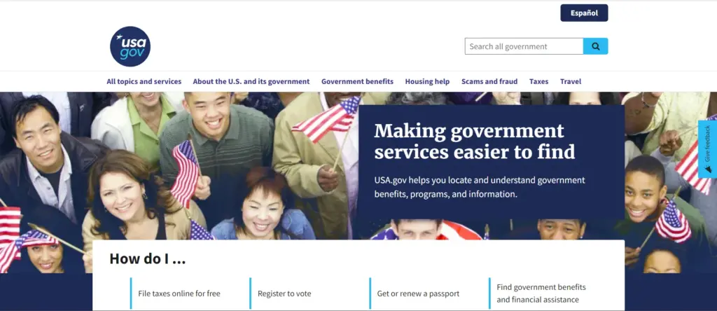
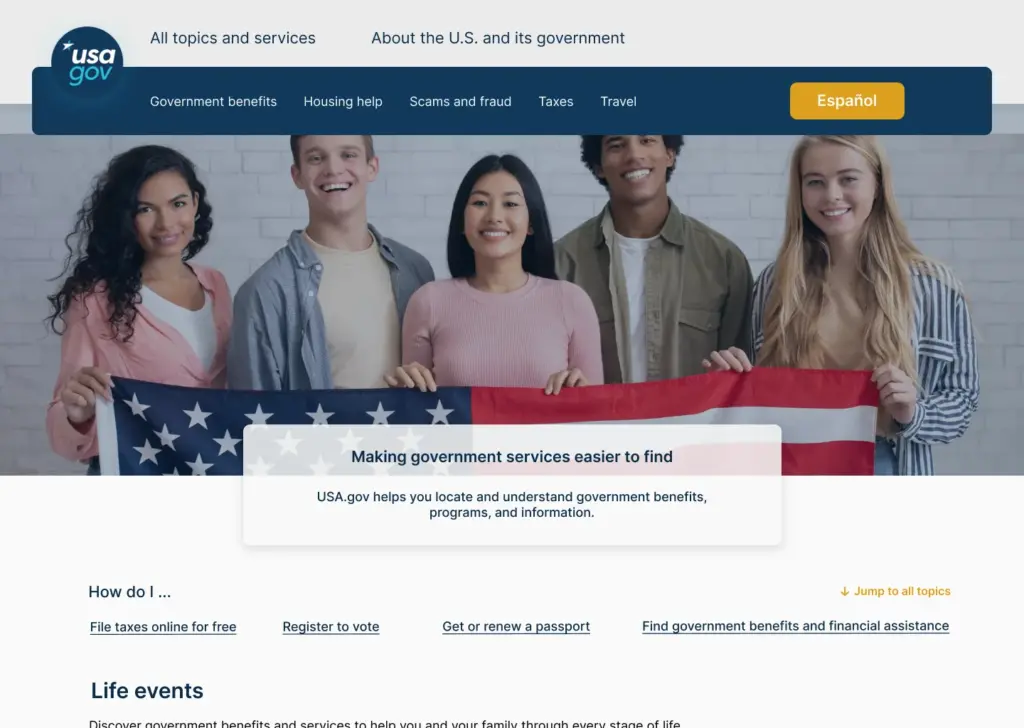
American government website redesign
My goal for this redesign was that even government websites, despite their simplicity, can become much more user-friendly. Of course, this website is performing well compared to many government websites.
As you can see, to show the responsive design, all 3 sizes (desktop, tablet and mobile) are placed separately.
The original website:
9 May, 2024
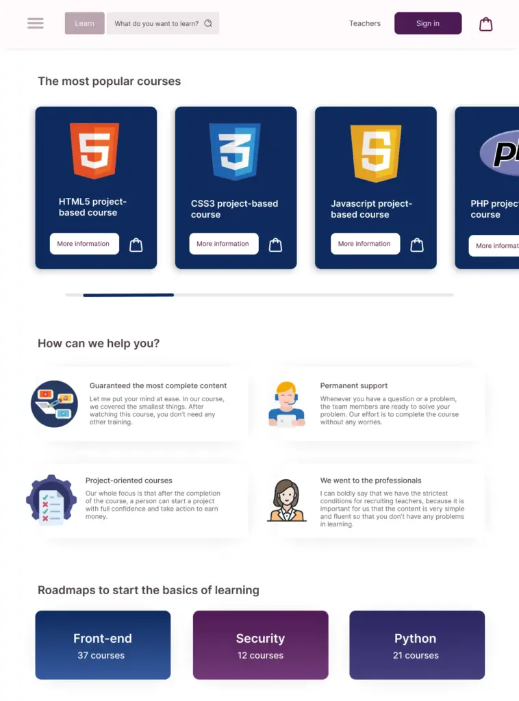
An Online Learning Platform
70% of the first page of a website to offer and sell training courses related to developing websites.
The biggest challenge I had in this project is putting the colors next to each other, especially to emphasize and harmonize it with the main color of the website.
April 15, 2024
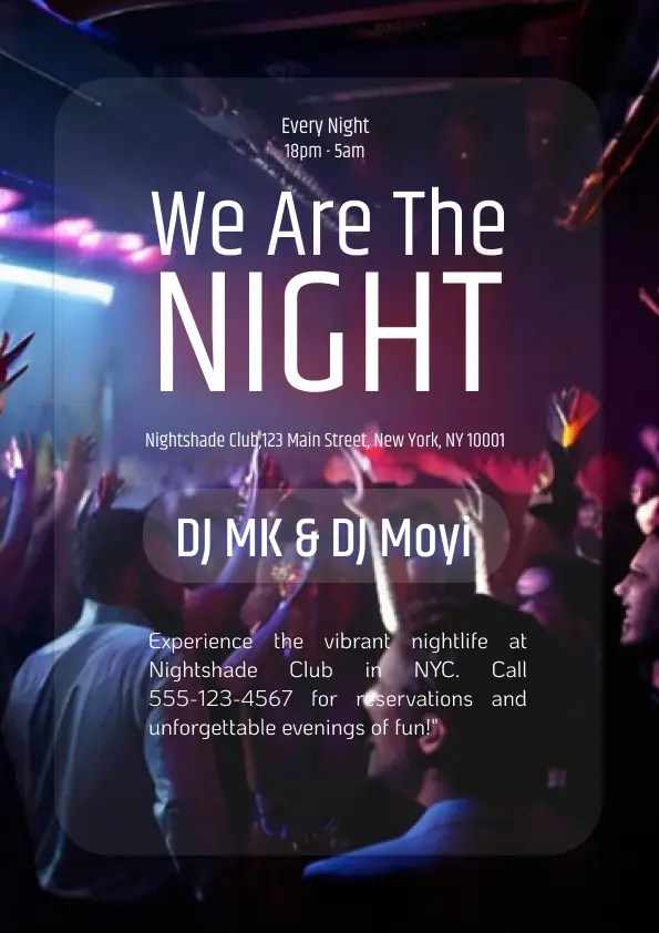
Poster for a Nightclub in NYC
This is a poster for a night club where you can see the exclusive photo of the club in the background and the rest in a brief but complete way.
April 3, 2024
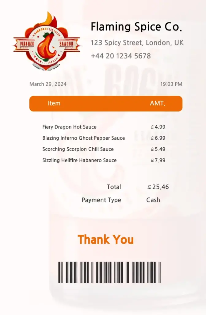
Receipt for a Hot Sauce Brand in the UK.
This is a hot sauce brand in the UK. Under the fictitious name “Flaming Spice Co.”. It should be noted that all names, logos, numbers and barcodes are fictitious.
My challenge in this design was that, because I had never designed a reach before, I came up with this summary by looking at a few templates.
March 29, 2024
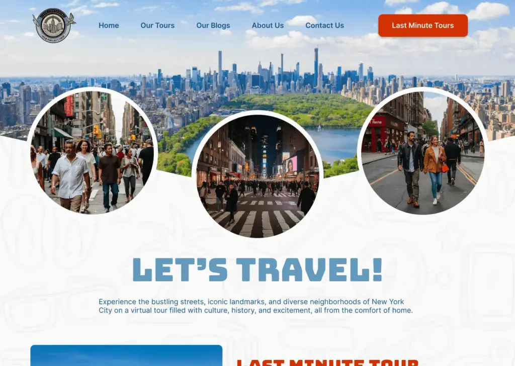
Main Page of a virtual Tour Website
This is a home page for a virtual tour, focusing on New York City.
All the items enter the page with an explosion and have interesting hovers to make the page more attractive.
February 25, 2024
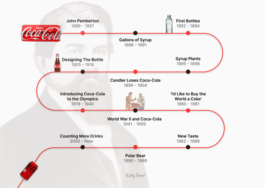
Coca-Cola Timeline
This was the timeline challenge.
I chose the Coca-Cola company because of my interest in it and made this timeline from its history.
One of my challenges was that I always like to use different photos in such designs that it was challenging for me to place them. You can also see the latest and newest can of Coca-Cola at the end, which shows that the progress and changes of this company continue.
This page has been redesigned without losing any part of it. By changing the placement of elements, colors and shapes, I made this page more eye-catching. The only part that has been removed is the text section, which I added a help option to help the audience see the rest of the content there.
You can also see mobile responsiveness in the second section (with the opened menu).
My challenge on mobile was that I was trying to have the logo in a part of the page but the header was not in the right place. And I am satisfied with the final result
February 5, 2024 / March 4, 2024
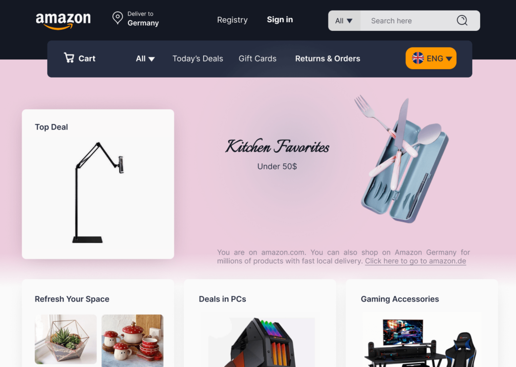
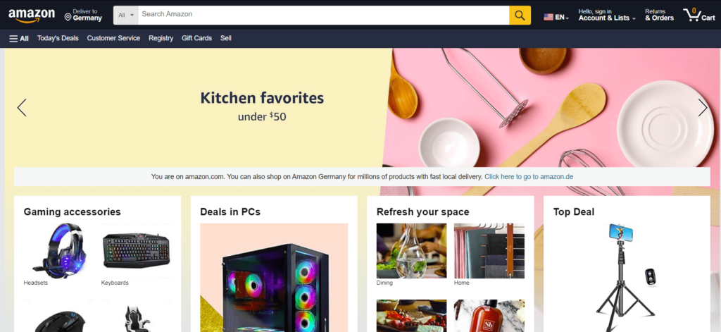
The "Amazon" website redesign
Today’s challenge for me was to redesign the home page of a famous site, and I chose Amazon. The second photo is the main website page.
The most difficult part of the redesign was the commitment to not removing elements while still fitting them onto one page so that it didn’t look as cluttered as the original website. Also, the empty spaces of the main website do not feel good.
In general, in my opinion, the home page of Amazon has not worked properly in terms of placing elements, even selecting photos and colors. My attempt was to minimize these mistakes.
February 19, 2024
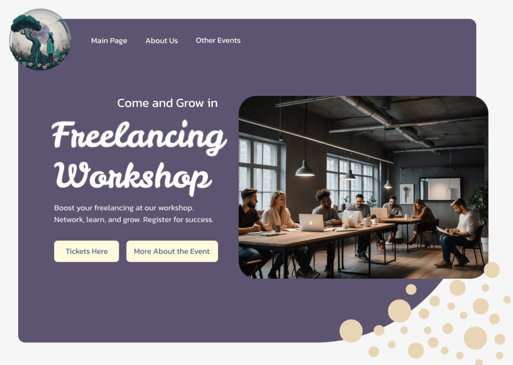
Landing Page for an Upcoming Workshop
This landing page is for a workshop for freelancers and you can see its logo on the top left.
Users will be transferred to the main page of this workshop by clicking the “more information” button.
My challenge in designing this landing page was to fill the white (empty) spaces that I preferred silence and simplicity to the rest.
March 11, 2024
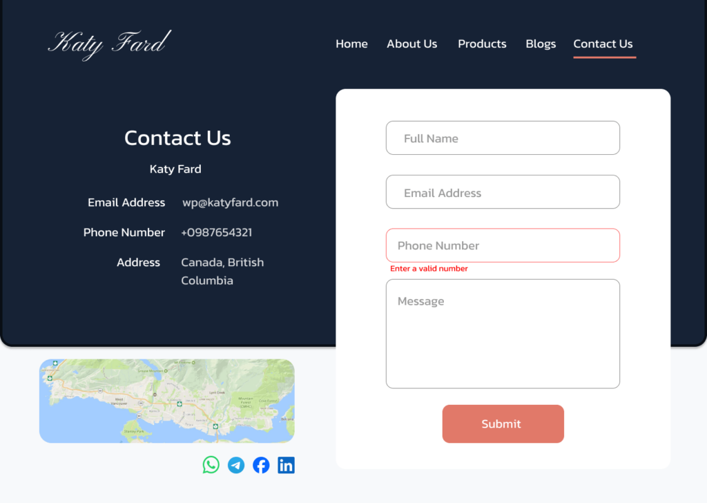
Contact Us
This is a one-page contact us page.
My challenge in this work was to put social network icons that I wanted to use and I think it was the right place for them. Also, one of its parts was its message error, which was placed in the phone number section.
The header is for a small online shop that does not have any other special section except for its products.
January 16, 2024
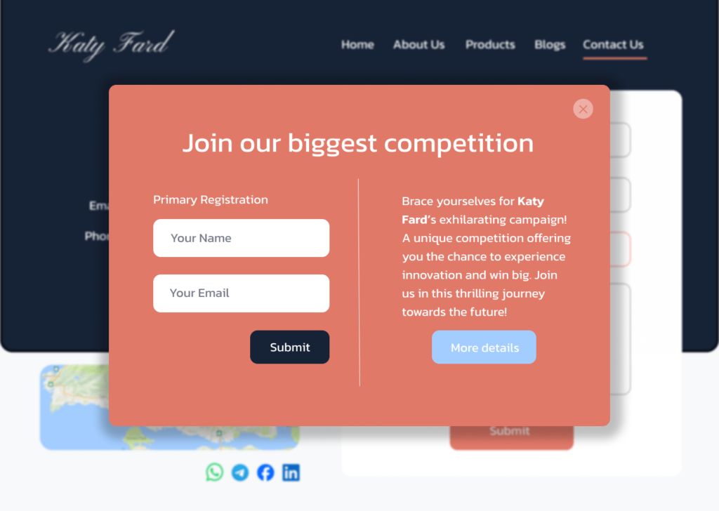
Pop-up to Inform the Campaign
This is a pop-up to announce a big campaign of a company. So that after 40 seconds it will be displayed on every page of the website (this page is said hypothetically.) If the person does not register the first time, it will be displayed only 2 times, because I care a lot about not bothering the user.
August 13 , 2024
Faco coffee shop front page
This is a GIF.
This design is done for an imaginary coffee shop that is a combination of wood and brown color above the sky.
Considering that there is only one page for this coffee shop, I tried to include all the necessary items to choose this cafe (except the menu). The reason I didn’t mention the menu is because, in my opinion, the menu needs a completely separate page with a unique design.
January 9, 2024
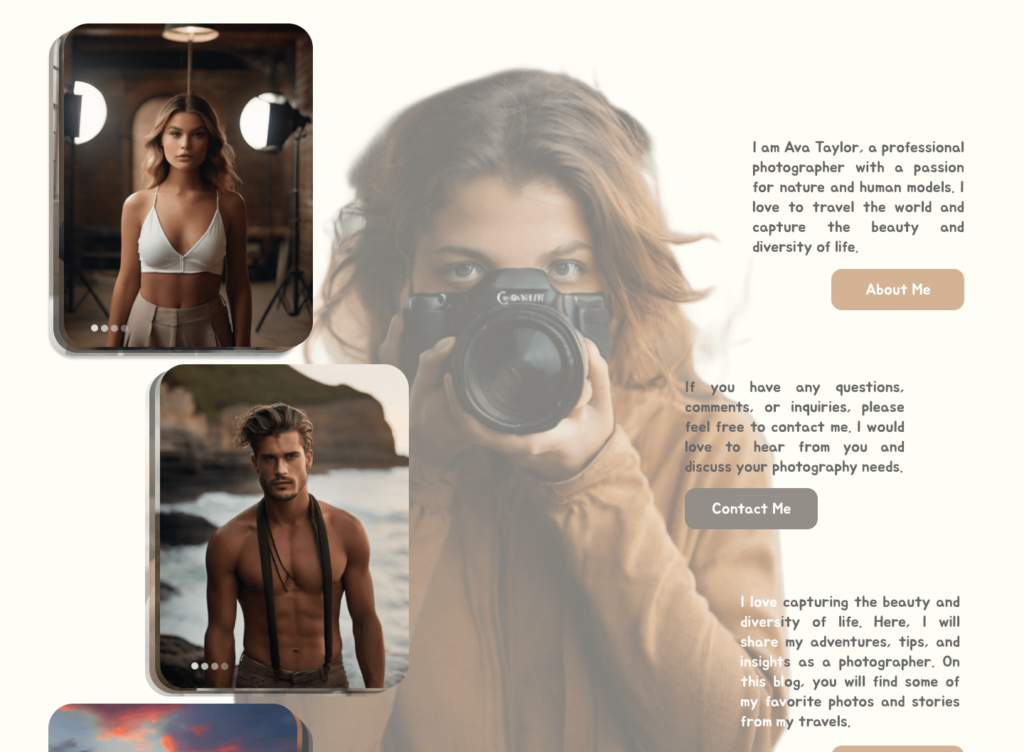
Photographer's portfolio
All photos are made with AI.
This portfolio is for a shy beginner female photographer whose fake photo you see in the middle of the page. Ava Taylor’s information is on the right and her portfolio is categorized on the left.
My challenge in making this page was that I decided to put all the photos on one page and finally I categorized them into 3 categories: female models, male models and nature. By clicking on each category, the category will be opened and the photos will be displayed, and finally you can be directed to the desired page.
February 6, 2024
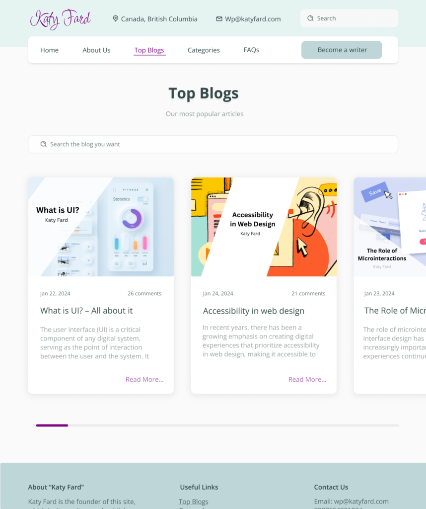
A page from a new blogging website
This page is for popular blogs. Instead of vertical scrolling, I chose horizontal scrolling to see blogs (with card style), which is more attractive and new.
Of course, I was aware of the scroll indicator that can be seen on the right side of every browser, but I chose not to consider it because the browser itself applies it.
I also used the blogs of my website, although their publication dates are not real.
January 25, 2024
Package description page
The person who requested this design likes exaggeration yet simplicity. Especially with colors. So I used more dark colors than normal. The packages are displayed as a horizontal scroll, and their descriptions are included in the table in a comparative manner in the final section.
The logo is placed symbolically. Also the prices are not real.
February 2, 2024
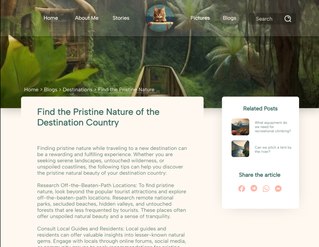
Blog Template for Travel Website Named "Caty Travel"
This is a template for a travel website. In this way, the featured photo is placed at the top of the page and the content is displayed below it. The sidebar of this page is in a sticky mode that can be dragged to the bottom of the page by scrolling. I also designed the logo of this website and I chose the cat because the owner’s name is Caty (me).
February 29, 2024
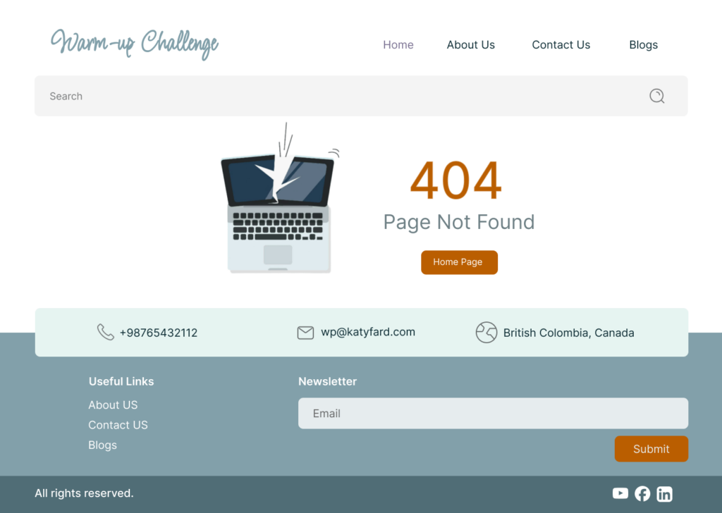
404 Error Page with Header and Footer Details
My goal in this challenge was to design a page with a complete header and footer, to which I added a 404 error.
I intended this page to be for a freelancer’s website, so I included a laptop element. The main color for this page is #82A0AA (the green you see in the logo), which blends well with other colors.