This page is designed for a space tourism company that takes humans into space, which has a very simple design to focus on more information, given the great start.
I chose orange as the main color to represent confidence, passion, warmth and adaptability. I also removed the box in the design because everything is suspended in space and my inspiration was emptiness.
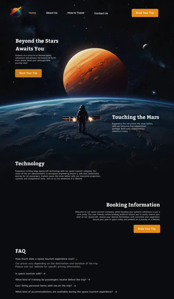
On the other hand, the considered image shows looking at Mars and the desire to go there, which this company makes it come true. The mission of the company is shown in the picture.
This company was a start-up, but for obvious reasons, the names and original logo have been completely changed.