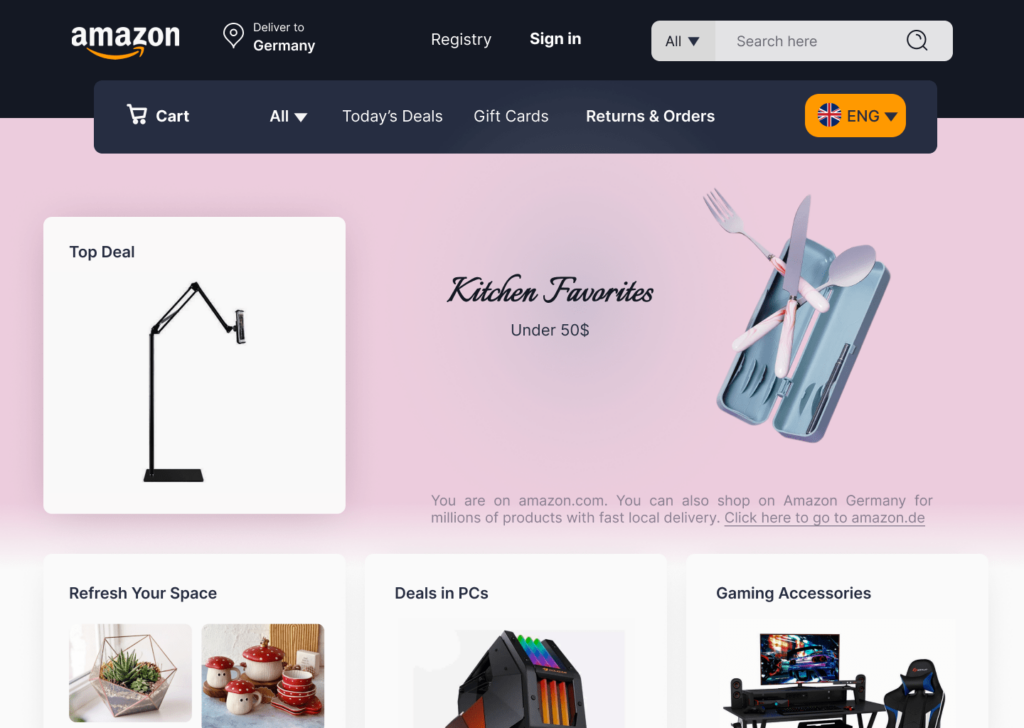
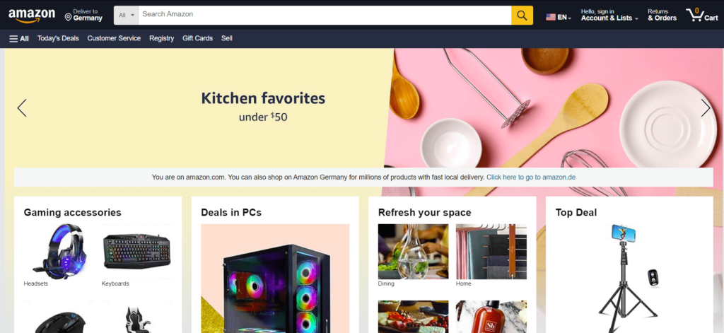
Email: wp@katyfard.com

Redesigning Amazon website in warming up challenge by Katy Fard
Amazon Websites in warming up challenge

The "Amazon" website redesign

This project was a challenging endeavor with the goal of redesigning the Amazon homepage to optimize its user experience. My main focus was on resolving the visual clutter and improving the layout of the elements.

The Main Challenge: While highly functional, Amazon’s current homepage appears visually overwhelming. The sheer number of elements, lack of sufficient whitespace, and the choices of color and imagery all contribute to a sense of visual chaos. My biggest challenge was to retain all the essential elements of the original website—such as the search bar, categories, and promotional sections—without the final redesign feeling equally cluttered and confusing.

Solution and Execution: To achieve a minimalist and functional design, I adopted a different approach. Instead of piling on information, I focused on visual hierarchy and strategic use of whitespace.

  • Reducing Clutter: By intelligently grouping elements and using strategic whitespace, I managed to create a cleaner and more organized look.

  • Visual Improvement: I also updated the color palette and chose more appealing images, aiming to deliver a pleasant and modern visual experience.

This redesign demonstrates how a meticulous and thoughtful approach can visually enhance a large and complex website without sacrificing functionality, providing a smoother and more user-friendly experience for the audience.

February 19, 2024