These challenges are designed with Figma and are for visual representation.
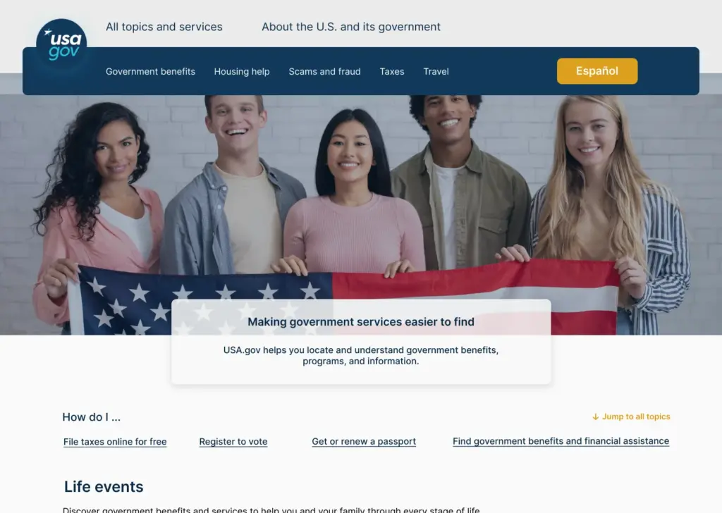
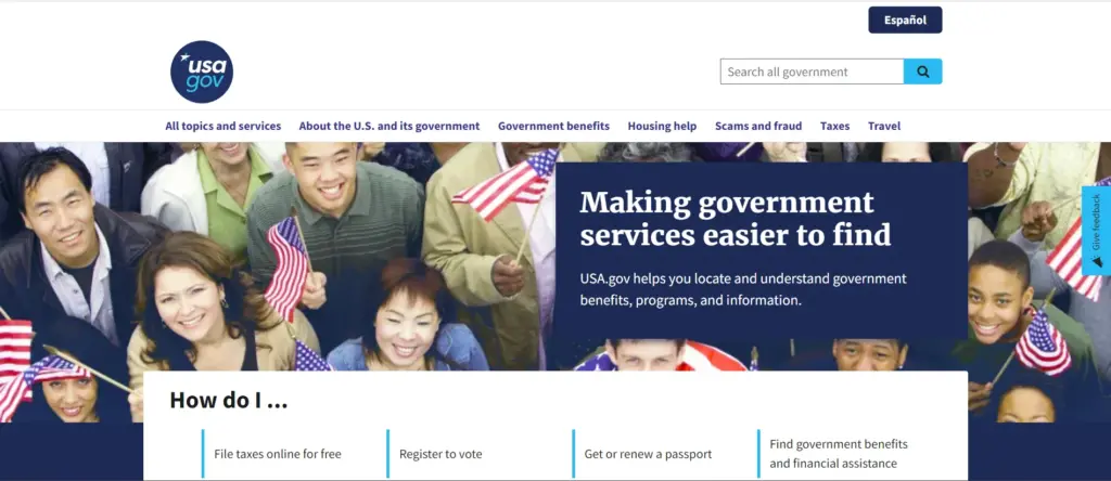
American government website redesign
My goal for this redesign was that even government websites, despite their simplicity, can become much more user-friendly. Of course, this website is performing well compared to many government websites.
As you can see, to show the responsive design, all 3 sizes (desktop, tablet and mobile) are placed separately.
The original website is the second image.
9 May, 2024
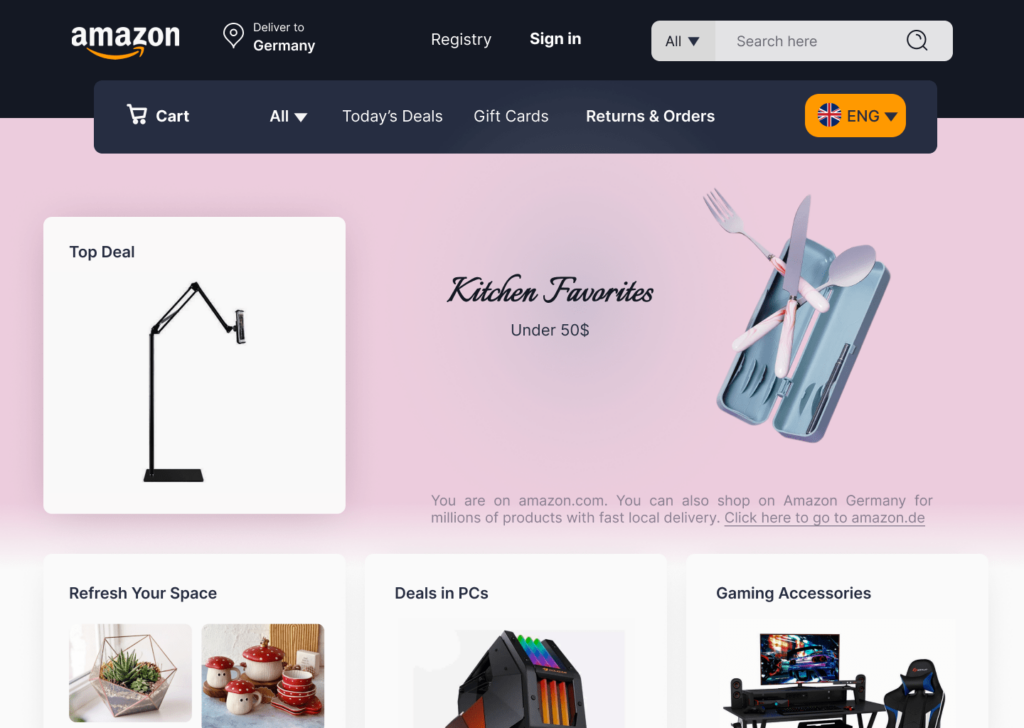
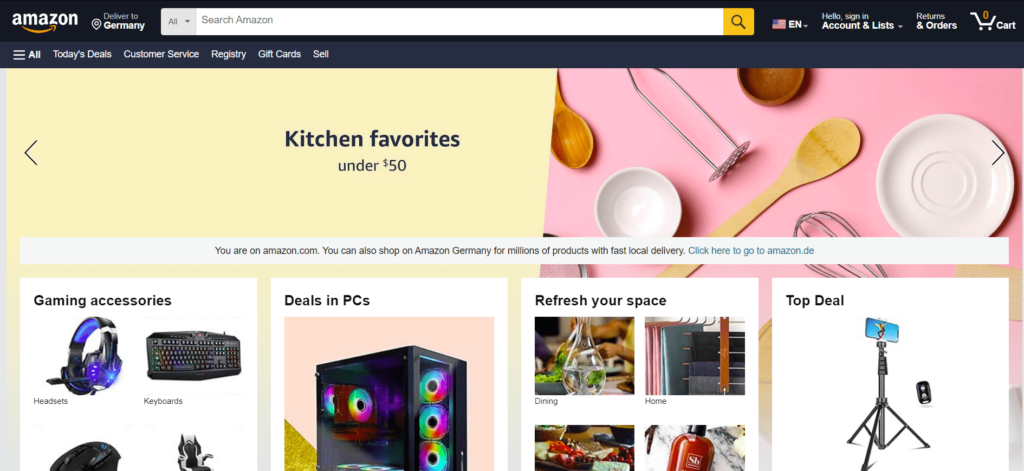
The "Amazon" website redesign
Today’s challenge for me was to redesign the home page of a famous site, and I chose Amazon. The second photo is the main website page.
The most difficult part of the redesign was the commitment to not removing elements while still fitting them onto one page so that it didn’t look as cluttered as the original website. Also, the empty spaces of the main website do not feel good.
In general, in my opinion, the home page of Amazon has not worked properly in terms of placing elements, even selecting photos and colors. My attempt was to minimize these mistakes.
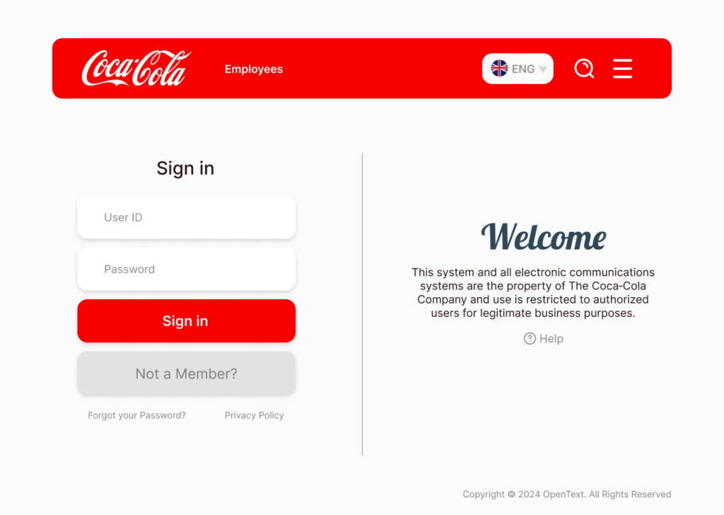
This page has been redesigned without losing any part of it. By changing the placement of elements, colors and shapes, I made this page more eye-catching. The only part that has been removed is the text section, which I added a help option to help the audience see the rest of the content there.
You can also see mobile responsiveness in the second section (with the opened menu).
My challenge on mobile was that I was trying to have the logo in a part of the page but the header was not in the right place. And I am satisfied with the final result