
Typography is not just about choosing pretty fonts—it’s a fundamental part of how users experience your website. Whether you’re building with Elementor or any other WordPress builder, mastering typographic scale can be the key to a professional and impactful design.
As a WordPress website designer at Katyfard.com, I’ve seen how smart typography transforms not only the look but the entire feel of a website. This guide is written for designers like me—people who may not code but want their websites to look polished and purposeful.
Let’s dive in.
What Is Typography and Why Does It Matter?
Typography is the art and technique of arranging type. In web design, it’s one of the most critical elements that define a user’s first impression.
Why typography matters:
It builds visual hierarchy
It increases readability and comprehension
It sets the tone of your brand
It improves user engagement
It leads to higher conversion rates
A visitor doesn’t stay on a site that looks chaotic, no matter how good the content is. But clean, well-structured typography makes them stay—and read.
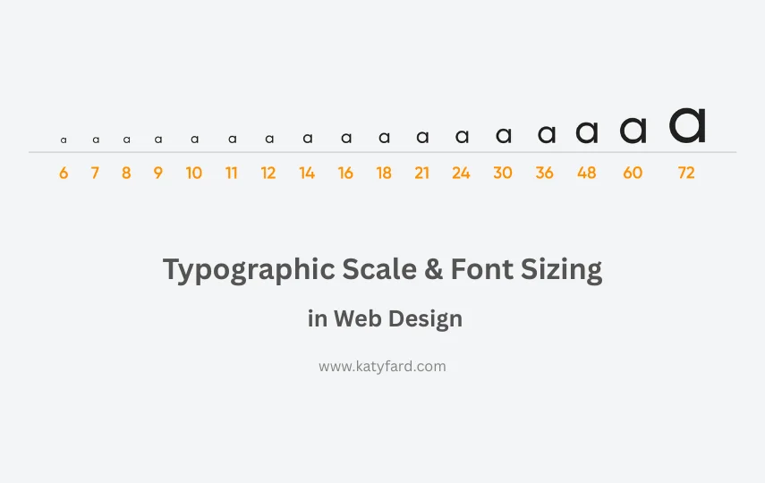
What Is Typographic Scale?
A typographic scale is a set of font sizes based on a ratio that creates consistency and rhythm throughout your design. Just like musical scales make melodies harmonious, typographic scales bring visual harmony to your content.
Think of it this way:
If your base body text is 16px, a logical, harmonious scale could include 20px, 24px, 32px, and 40px—each size chosen using a set ratio.
Why Typographic Scale Is Crucial
1. Visual Consistency
Everything looks connected and intentional. You don’t have jarring jumps between text elements.
2. Better Readability
With the right rhythm between headers and paragraphs, users can easily navigate the page and absorb content.
3. Responsive Design
When a scale is used, adapting to mobile becomes easier—you’re just resizing according to ratio.
4. Professional Appeal
Sites that follow a scale simply look more polished. Users feel the difference even if they can’t explain it.
5. Brand Identity
Typography becomes part of your branding. Just like the clean and consistent type on Katyfard.com, it sends a message: “This site is built by a pro.”
Common Typographic Scales
Here are a few commonly used scales you can choose based on the tone of your design:
| Scale Name | Ratio | Vibe |
|---|---|---|
| Minor Third | 1.2 | Subtle, balanced |
| Major Third | 1.25 | Modern, readable |
| Perfect Fourth | 1.33 | Strong, structured |
| Golden Ratio | 1.618 | Elegant, classic |
💡 Tip: For most websites, the Major Third or Perfect Fourth scale works great—it’s readable yet dramatic enough for headings.
You Don’t Need to Code to Use Typographic Scale
As a WordPress designer, you can achieve amazing typography without writing a single line of code. Here’s how:
✅ Use a quality theme
Themes like Astra, Kadence, and Blocksy support advanced typography options in their Customizer settings.
✅ Elementor or Gutenberg
Page builders like Elementor Pro let you assign global font sizes based on tags like <h1> to <h6>, body, small, etc. You can even set different sizes for desktop, tablet, and mobile.
✅ Online tools to generate your scale
Sites like Type-Scale.com let you generate a full typographic scale from a base size like 16px and a selected ratio.
Recommended Font Sizes for HTML Tags
Here’s a reference chart for setting font sizes in your design:
| HTML Tag | Suggested Size | Why It Works |
|---|---|---|
<body> | 16px | Global readability standard |
<h1> | 36–48px | Primary title, needs strong presence |
<h2> | 28–32px | Section heading, eye-catching but balanced |
<h3> | 22–26px | Sub-section title |
<h4> | 18–22px | Minor headings, still distinct |
<h5> | 16–18px | Often used for captions or labels |
<h6> | 14–16px | Least important headings |
<p> | 16px | Comfortable for long reading sessions |
<small> | 12–14px | Notes, disclaimers, subtle info |
📌 These values are guidelines. Adjust based on your site’s tone, brand, and audience.
Real-World Example: Katyfard.com
On Katyfard.com, I use a scale of 1.25 (Major Third) with a base font of 16px. This gives me a natural progression for headings, keeping things harmonious.
This kind of scale helps visitors flow through the content effortlessly, reducing cognitive load and improving conversion.
Best Practices for WordPress Designers
You don’t need to be a developer to build with scale. Just follow these tips:
Use REM or EM instead of pixels for flexible typography
Set mobile-specific font sizes in your builder
Use different font weights to reinforce hierarchy (e.g., bold for H1, regular for paragraphs)
Mind your line height (1.4–1.6 is a good range for body text)
Maintain enough space around elements—whitespace makes or breaks your design
Common Typography Mistakes to Avoid
🚫 Using random font sizes with no system
🚫 Tiny body text (less than 15px)
🚫 Overusing bold or italic
🚫 Forgetting to adjust font size for mobile
🚫 Choosing too many different fonts
Final Thoughts
Typography is your invisible design superpower. Mastering typographic scale gives your site rhythm, structure, and elegance. Even if you never touch code, using the right tools and ratios puts you a step ahead of most designers.
And if you’re ready to create a website that looks and feels like a high-end brand, head over to Katyfard.com and see how we help creative businesses shine online.
Ready to Level Up?
If you need help crafting a site with typography that feels right, drop me a message. I offer design consultations, complete website builds, and full typography setups for WordPress.
📩 Let’s chat: Instagram – @katywebdesign
Hi dear Katy Fard can you please explain in what ways typographic scale can affect a user’s perception of a brand’s personality?
Hello Mina,
A thoughtful typographic scale signals professionalism, confidence, and clarity. Large, bold headings suggest energy or innovation, while subtle text sizes can feel elegant or minimalist. Typography hierarchy guides attention and conveys whether a brand is playful, serious, modern, or traditional.
Thank you
Awesome
I’m glad it was useful for you.
Very good
I’m glad it was useful for you.
Awesome
I’m glad it was useful for you.