Shamim-e Bahar
Shamim Bahar is a well-known rehabilitation and educational center in Iran that offers many different activities, including cognitive rehabilitation, speech therapy, art therapy, self-help and self-care skills, etc.
The site was designed in 15 days and the goal of having a website was to become more known and present in cyberspace, and gain more customer trust.
November 2024
Main Page
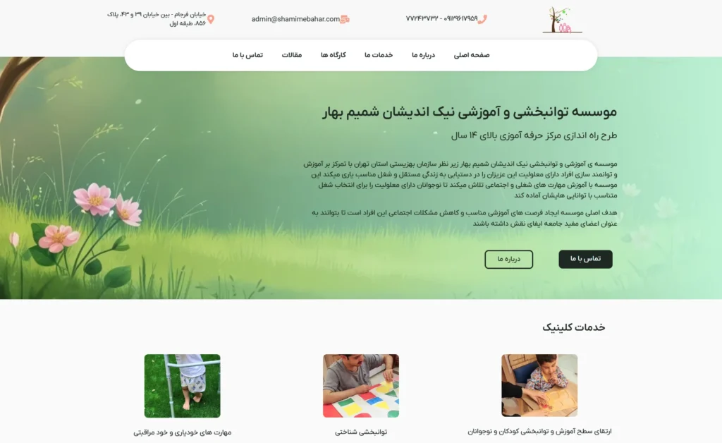
On the first page, I introduced Shamim Bahar Rehabilitation Complex and then introduced the services with relevant photos.
Finally, the sections included an invitation to join Instagram, introduction of the latest workshops, a contact form, and introduction of the latest articles.
Footer
The footer you see is designed in a dark color consistent with the site and includes a short text about the service company itself, quick access links, social network links, and the address of the collection in Iran. The bottom section states that intellectual property rights are reserved and introduces the designer and supporter of the site (me).

About us and Contact us Pages
Click on the photos to enlarge and view them.
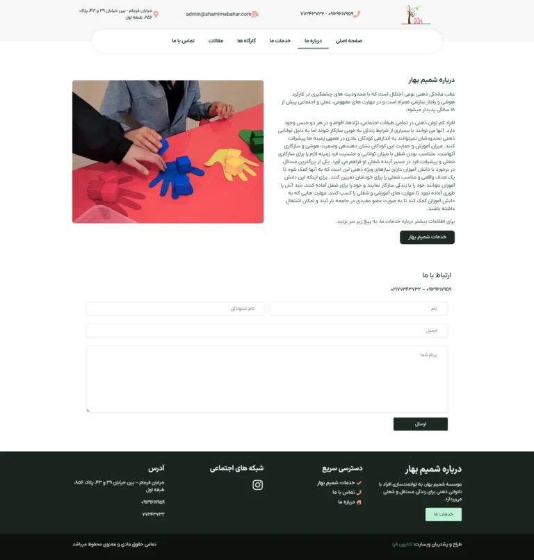
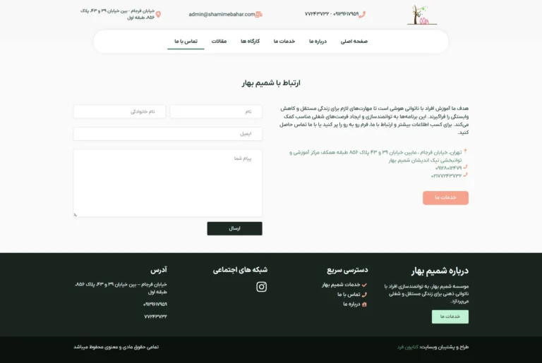
These 2 pages on Shamim Bahar’s website include the About Us and Contact Us pages.
The Contact Us page includes a contact form and contact information, and the About Us page includes a more detailed description of the company and contact information to maintain the CTA.
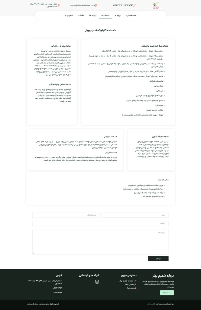
Our Services
On this page, due to the large number of services and the length of their introduction, in order to avoid monotony and boredom and to encourage the viewer to read the services, a new mosaic design technique has been used, in which each service has its own mosaic. Ultimately, it looks simple and interesting.
Challenges in Shamim-e Bahar Project
1. As explained in the previous section, the number of services and their descriptions was very large: I overcame this challenge with a mosaic design and turned it into an attractive design.
2. A large treasure trove of videos to use on the site instead of photos: The videos were reviewed one by one and attractive photos were made from them.
3. The simplicity and rawness of the photos: This was tried to be overcome by cropping and how the photos were used.
