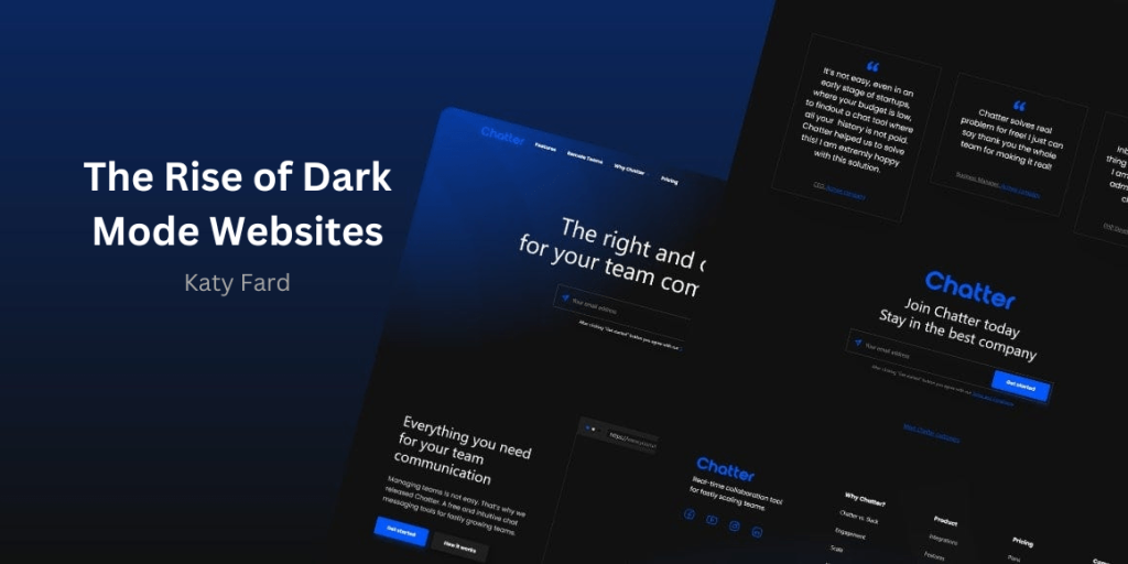
The rise of dark mode websites has been a significant trend in web design and user interface development in recent years. Dark mode, also known as night mode or dark theme, refers to a color scheme that uses predominantly dark colors for the background, text, and other interface elements. This design trend has gained popularity across various digital platforms, including websites, mobile applications, and operating systems, and has had a notable impact on user experience, visual aesthetics, and technical implementation in web design.
Impact of Dark Mode Websites on User Experience
The adoption of dark mode websites can be attributed to several factors, including its potential benefits for user comfort, readability, and energy efficiency. By providing an alternative color scheme that is easier on the eyes, especially in low-light environments, dark mode has become a sought-after feature for many users. Additionally, the widespread use of devices with OLED and AMOLED displays, which can individually turn off pixels to display true black, has contributed to the appeal of dark mode due to its potential to conserve battery life.
From a user experience perspective, the impact of dark mode websites on users is multifaceted. The primary benefit of dark mode is its potential to reduce eye strain, particularly in low-light conditions. By using darker colors for text and backgrounds, dark mode can minimize the contrast between the screen and the surrounding environment, making it easier for users to read and interact with content for extended periods. This can be especially beneficial for individuals who spend significant amounts of time using digital devices, such as computer monitors, smartphones, and tablets.
Moreover, dark mode websites can offer a more immersive and visually appealing experience for certain types of content, such as multimedia and gaming applications. The use of dark backgrounds can enhance the contrast and vibrancy of images, videos, and graphical elements, creating a more engaging and dynamic visual environment for users. This can contribute to a more enjoyable and captivating user experience, particularly in entertainment and media-focused contexts.
It is essential to consider the potential drawbacks and challenges associated with dark mode from a user experience standpoint. One of the primary concerns is related to readability and accessibility. While dark mode can be easier on the eyes in certain conditions, it may also pose challenges for individuals with visual impairments or specific types of color vision deficiencies. The contrast between text and background colors in dark mode designs can make it difficult for some users to perceive and interact with content effectively.
How Will the User Experience be with Dark Mode?
The implementation of dark mode on websites and applications can vary significantly, leading to inconsistencies in user experience. Some websites may offer a seamless dark mode experience, while others may struggle to adapt their content and design elements to suit the darker color scheme. This lack of standardization can result in usability issues and frustration for users who expect a consistent experience across different platforms.
Another consideration is the potential impact of dark mode on content consumption and user engagement. While dark mode can offer a more comfortable viewing experience in certain contexts, it may also influence user behavior and interaction patterns. For example, some users may be more inclined to browse content for extended periods in dark mode websites, potentially leading to increased screen time and its associated effects on health and well-being.
In addition to the user experience considerations, the rise of dark mode has had a significant impact on web design and development practices. The implementation of dark mode in web design involves several technical and aesthetic considerations, including color selection, contrast optimization, and compatibility with various devices and platforms.
Challenges and Considerations
One of the key challenges in implementing dark mode in web design is ensuring that the visual hierarchy and readability of content are maintained across different color schemes. Web designers and developers must carefully consider color contrast, text legibility, and overall user experience when creating dark mode interfaces to avoid compromising the quality of the content. This often involves conducting thorough usability testing and accessibility assessments to ensure that dark mode designs are inclusive and user-friendly for a diverse audience.
Moreover, the technical implementation of dark mode on websites requires careful consideration of compatibility and performance. Designing and developing dark mode features that seamlessly adapt to different devices, screen sizes, and user preferences can be a complex task. Ensuring that both dark mode and traditional light mode designs are fully functional and visually appealing across various platforms requires attention to detail and thorough testing.
From a development perspective, maintaining and updating dark mode features alongside traditional light mode designs can introduce complexity and overhead for web developers. This includes considerations such as managing color themes, optimizing performance, and addressing compatibility issues with certain web technologies, such as older CSS frameworks or third-party plugins. As a result, the implementation of dark mode in web design often requires collaboration between designers, developers, and stakeholders to ensure a cohesive and consistent user experience.
In recent years, major web browsers and operating systems have introduced native support for dark mode , allowing users to enable dark mode across various websites and applications. This has led to an increased demand for websites to provide optimized dark mode experiences, prompting many organizations to prioritize the implementation of dark mode features in their web design and development efforts.
The rise of dark mode has also influenced the visual aesthetics and branding considerations for websites and digital products. Designing for dark mode requires a reevaluation of color palettes, typography choices, and visual elements to ensure that the overall design remains cohesive and visually appealing across different color schemes. This has led to a shift in design trends, with many websites and applications embracing dark mode as a core aspect of their visual identity and user experience.
Furthermore, the implementation of dark mode websites has implications for content creation and management. Content creators and publishers must consider the impact of dark mode on the presentation and readability of their content. This includes optimizing images, videos, and other multimedia assets to ensure that they are well-suited for dark mode environments and maintain their visual impact and clarity.
Conclusion
In conclusion, the rise of dark mode websites has had a significant impact on user experience, web design, and development practices. While dark mode websites offer potential benefits for user comfort, readability, and energy efficiency, it also presents challenges related to accessibility, design consistency, and technical implementation. As the adoption of dark mode continues to grow, it is essential for designers, developers, and stakeholders to carefully consider these factors and strive to create inclusive, user-friendly experiences that cater to a diverse range of user needs and preferences.


Wow, I didn’t think that the discussion of dark mode in website design is so serious and complicated!
Hello dear Misha,
Do not try to complicate the matter for yourself. These are things that you can easily handle with a little study and following the principles.
I wish you success.
This article was very interesting Katy!
Are there more fans of dark mode websites or light mode?
Thank you for your kindness Darno
It’s difficult to say definitively which mode is more popular, as preferences can vary widely among individuals. However, dark mode has gained popularity in recent years due to its potential benefits such as reduced eye strain and improved battery life on certain devices. Ultimately, the choice between dark mode and light mode often comes down to personal preference.
Do you think dark mode sites are more effective than light mode sites?
Hello Sandy;
There isn’t a definitive answer to whether dark mode sites are more effective than light mode sites, as it largely depends on user preferences and the context in which the website is being used. Dark mode can be easier on the eyes in low-light environments and may reduce eye strain for some users. However, light mode may be preferred by others, especially in bright environments. Ultimately, offering both dark and light mode options can be the most effective approach, as it allows users to choose based on their individual preferences and needs.
Ever since I read this article, I realized how interesting dark mode is, and I put everything on dark mode.😂😂😇
To be honest, I also became more interested in dark mode 😂
Me too 😂
Hello Katy Fard!
The difference between the design of dark mode and light mode can be summed up in what elements?
Hey Lou;
The design of dark mode and light mode primarily differs in terms of color scheme, contrast, and readability. In dark mode, darker backgrounds and lighter text are used to reduce eye strain in low-light environments, while light mode typically features lighter backgrounds with darker text for optimal visibility in well-lit conditions. Additionally, the use of accent colors and the overall visual hierarchy may also vary between the two modes to ensure a consistent user experience.
How does the use of dark mode in web design affect user engagement and retention?
Dark mode in web design can have a positive impact on user engagement and retention. For some users, dark mode can reduce eye strain and fatigue, especially in low-light conditions. This enhanced readability can lead to longer periods of interaction with the website or app, ultimately increasing user engagement. Additionally, dark mode can create a more immersive and aesthetically pleasing user experience, which can contribute to higher retention rates. However, it’s important to note that the impact of dark mode on user engagement and retention can vary depending on the target audience and the specific design and content of the website or app. Overall, incorporating dark mode as an option in web design can enhance user experience and may positively influence engagement and retention metrics for certain user groups.
Thank you
Hello Katy Fard,
I have a question for you.
How does the use of dark mode on websites affect how easy it is for people with vision problems to read the content?
Hello Cassie,
thank you for your question.
Dark mode can make it easier for people with vision problems to read website content. The dark background of websites reduces the contrast between the text and the screen, which can reduce eye strain and make it easier for some users to read text. Additionally, dark mode websites can minimize the amount of light emitted by the screen, which can be beneficial for those with sensitivity to bright light. However, individual preferences and conditions vary, so it’s essential to provide users with the option to choose between dark mode and light mode based on their specific needs and preferences.
Katy what are some ways to make sure everyone can use the website comfortably
Hello,
To ensure everyone can use a website comfortably, it’s important to prioritize accessibility. This includes using clear and easy-to-read fonts, providing alternative text for images, and ensuring proper color contrast. Implementing user-friendly navigation and providing text-to-speech options can also enhance accessibility. Additionally, offering dark mode websites as an option can accommodate users with varying vision preferences and reduce eye strain. Conducting regular accessibility assessments and incorporating feedback from diverse user groups can further improve the website’s inclusivity, making it more comfortable for everyone to navigate and interact with.
I have a question Katy!
How does dark mode impact user experience, especially in terms of reducing eye strain in low-light conditions?
Hello,
Dark mode makes the screen darker, which can make it easier on your eyes when you’re in a dark room. This can help reduce eye strain and make it more comfortable to read or look at the screen, especially at night. The contrast between the dark background and light text also makes it easier to see things clearly. So, dark mode can be more pleasant for your eyes and make it easier to use your device in low-light conditions.
How interesting the world of dark mode is
It is!